Neale Whitaker on designing the perfect guest bedroom

Some 15 years ago, my partner David and I flew into Auckland on a wet, black, winter night. It was late and we were cold and tired when we finally arrived at our hotel, a grand old mansion in Ponsonby. As long as I live, I will remember opening the door to our room that night. Lamps had been lit and a fire was glowing warmly in the hearth. A bottle of red wine sat open with two generous glasses-in-waiting and a simple, late-night supper lay on trays beneath white cloths. What I recall most vividly, however, is the operatic aria playing softly (a good old CD in those pre Bluetooth days) to make a special welcome truly magical. Needless to say, we slept well that night.
Over the years I’ve been fortunate to stay in some magnificent hotels - from Bangkok to Bali, London to LA. I’ve experienced five-star luxury and then some, but that small boutique hotel in Auckland was pretty near nirvana. Its appeal was simple and sensuous - and exactly what we needed at that moment. Our actual needs had been anticipated. To me that’s the key to the perfect guest bedroom, whether in a hotel or at home.
Finding the ideal bed
My fellow judges on The Block and I have occasionally been at loggerheads over the many guest bedrooms we’ve all judged together. While it may be a luxury, a guest bedroom doesn’t necessarily need a walk-in wardrobe. What it does need though, is somewhere to place an overnight bag and hang a few clothes. An ensuite or private bathroom (that is, one not shared by the rest of the house) is always desirable and while a desk in the corner is a nice touch, how often do we really need it as a house guest? In my opinion what a guest bedroom requires (and I’m talking home here, not the Ritz-Carlton) is a comfortable bed - the largest the room will allow - with generous bedside tables and adequate reading lamps. A comfortable chair if the size of the room permits, curtains or blinds with good blockout - and privacy.
As with most things interiors-wise, there are no rules, but I’ve never personally believed guest bedrooms need a generic approach. No one-aesthetic-fits-all styling. If a home is art-filled and decorative, then why shouldn’t the guest rooms be? Likewise, committed minimalists shouldn’t feel the need to overstuff. Let maximalist guests savour the pared-back experience. After all, your guests are enjoying your home, hospitality and lifestyle. Let them enjoy what you enjoy - whilst anticipating their needs too.

Planning your style
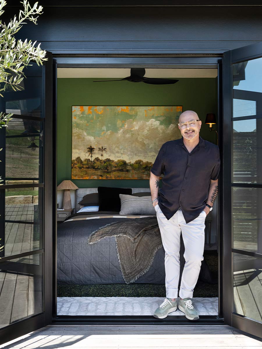
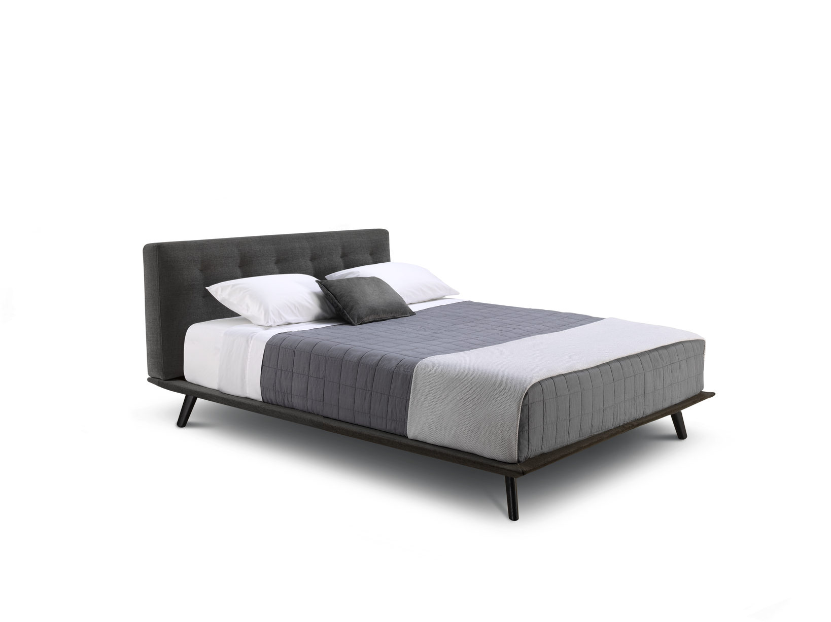
The bedroom at our guest accommodation on the NSW south coast required careful planning. With a total footprint of less than 10 square metres, each square metre had to earn its keep. Aesthetically, the bedroom reflects the colour and materials palette used throughout - gentle shades of green that mirror the surrounding rural landscape, and a warm, brick-tiled floor. Rustic, classic, luxurious and Australian. That was the brief David and I gave ourselves. It was important to remain true to our vision whilst creating a calming and restful bedroom for our guests. Call me old-fashioned (or maybe I’ve been judging The Block too long), but I think every guest room needs wow factor, even if it’s just one or two significant details. In our guest bedroom, French doors open directly to the deck and views across paddocks to the distant escarpment. Judging that our guests would want to wake up to that view (and perhaps contemplate it over breakfast in bed), we chose a King Living Encore Queen Bed to face the French doors. With an eye to both style and functionality, we added a King Living Sleep+ Mattress. Bed + mattress + view = wow factor.

Getting the details right
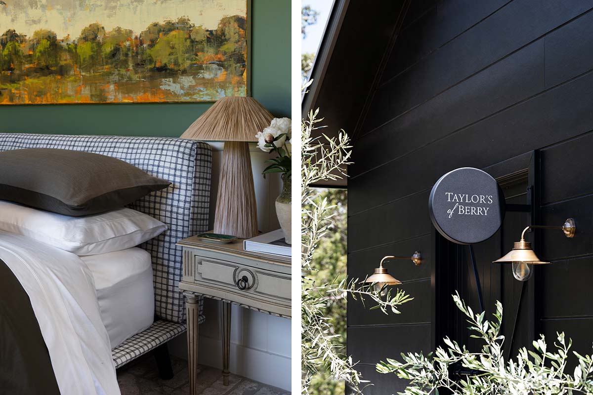
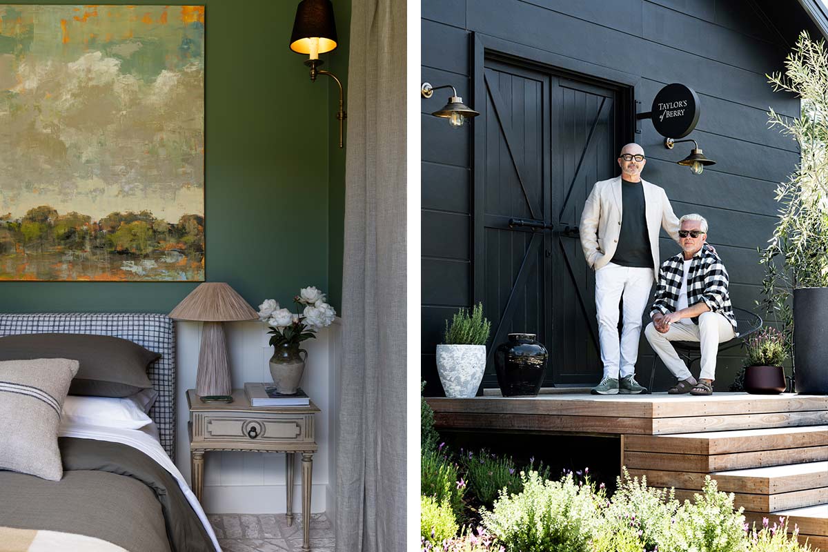
For the bedhead, we chose Eden Check in Ink for visual impact and decorative contrast with the colour palette (Wattyl ‘Green Hornet’ and Wattyl ‘Pale Mocca’). Antique bedside tables and woven raffia lamps were sourced locally to complement the very specific interior style, but King Living’s smoked glass Pallino Table Lamps would also work well in our setting. A traditional glass-fronted almirah serves as the perfect wardrobe, whilst artworks (Australian artist Lucy Vader’s There’s Only Us takes centre stage), wall sconces and a ceiling fan complete the stylistic details. Natural linen sheers and retractable shades were chosen to match those elsewhere in the guest house and salon-style sliding doors to elegantly connect the bedroom and living/dining area.
Details matter, at least they do to us. I remember a friend who liked to place little single-serve milk cartons (they’re called jiggers, since you ask) in her guest rooms to replicate the hotel experience. I never had the heart to tell her it felt more like flying economy. But I digress. Our guest bedroom has a diffuser in a subtle fragrance by a centuries-old French candlemaker (OK, it’s Trudon) that David and I felt was the perfect fragrance to wake up to. Not too sweet, not too woody. One guest remarked that she wanted to smell it forever. I’ll take that as a repeat booking.
For more interior inspiration and articles written by Neale Whitaker, explore the Neale article collection and discover more below:
- Neale Whitaker on living with pets
- Neale Whitaker explores emotionally durable design
- Neale Whitaker: Occasional furniture styling for individuality and function
Shop the story


